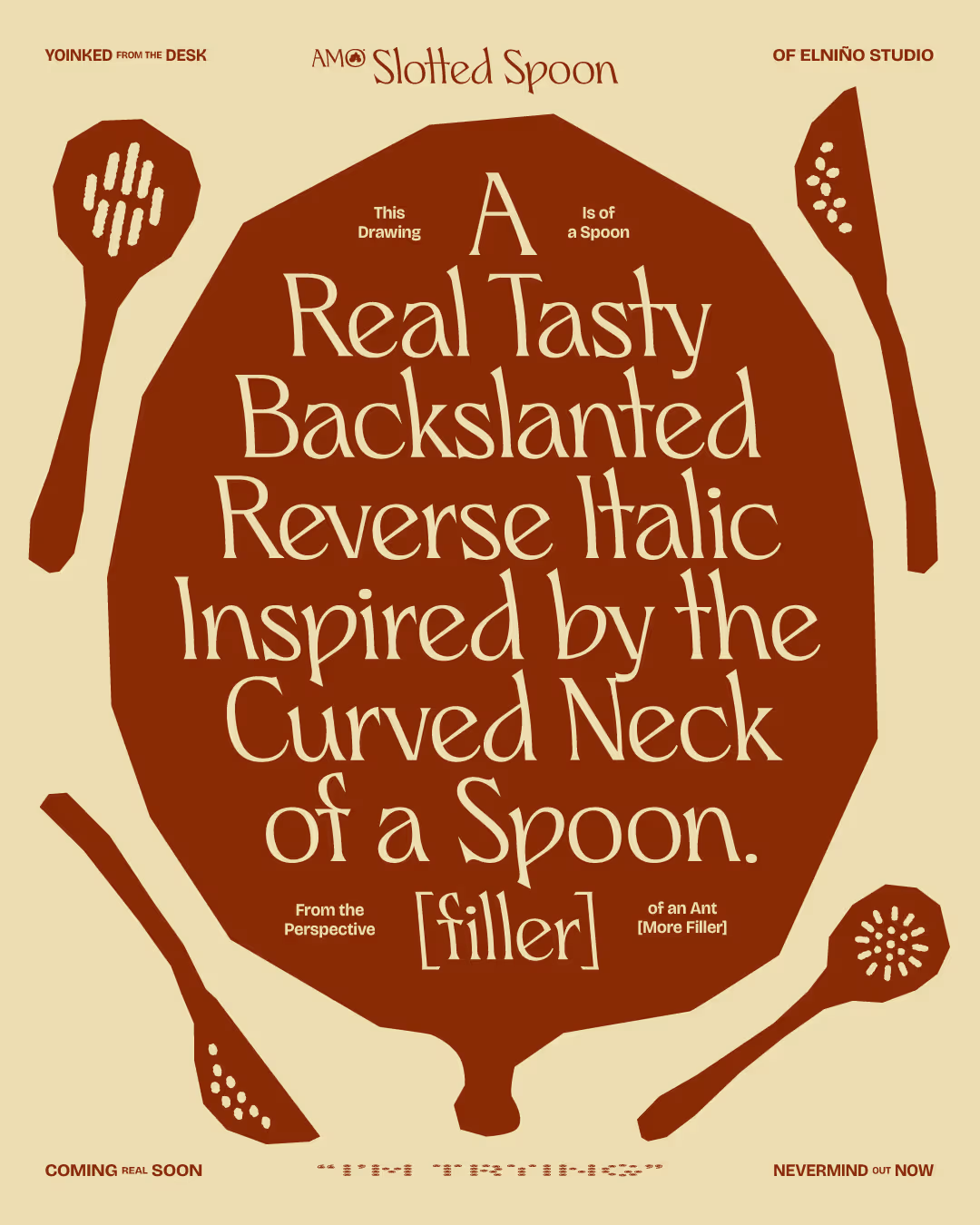
This font came from an unused grocery store concept back in 2021. Its off-kiIter back slant was inspired by a spoon's curved neck. Cool idea for a wordmark, but – hypothetically – could make you realize you bit off way more than you can chew when turning it into a font.
Tip: stare at the font long enough to experience the typographic equivalent of that post-treadmill walking sensation; any time I'd tinker with kerning for more than 30 mins, everything would look italic until my brain recalibrated. I don't know if that sounds like a fun selling point to you, or weird annoyance. Buy it and let me know.
CREATED
Jul. '25
updated
Oct. '25
current version
V.1
Take It for a Spin ↓
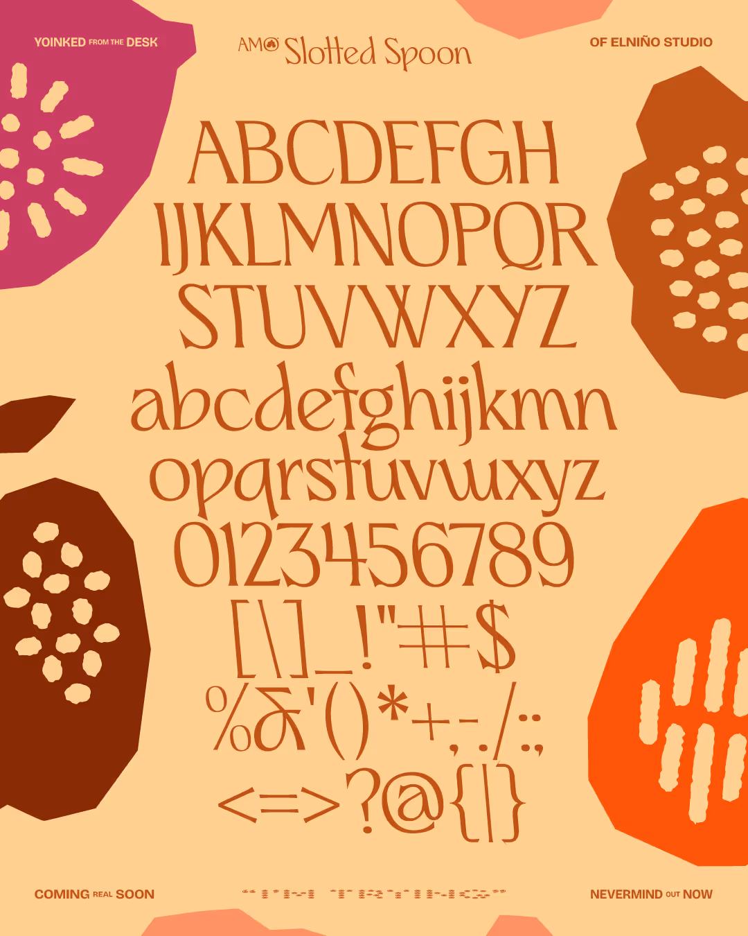
Current Features
v.1
Uppercase + Lowercase
v.1
Basic Latin
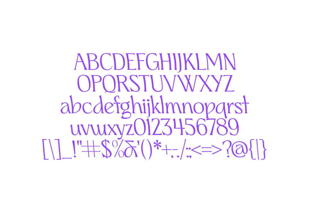
v.1
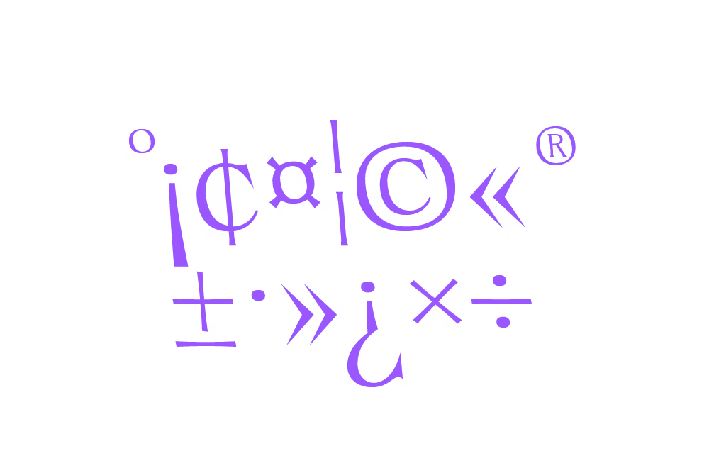
Latin-1 Supplement
v.1
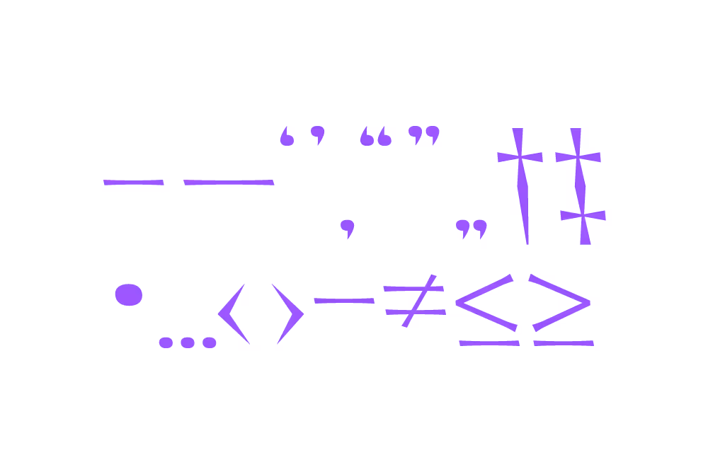
Punctuation + Math Operators
v.1
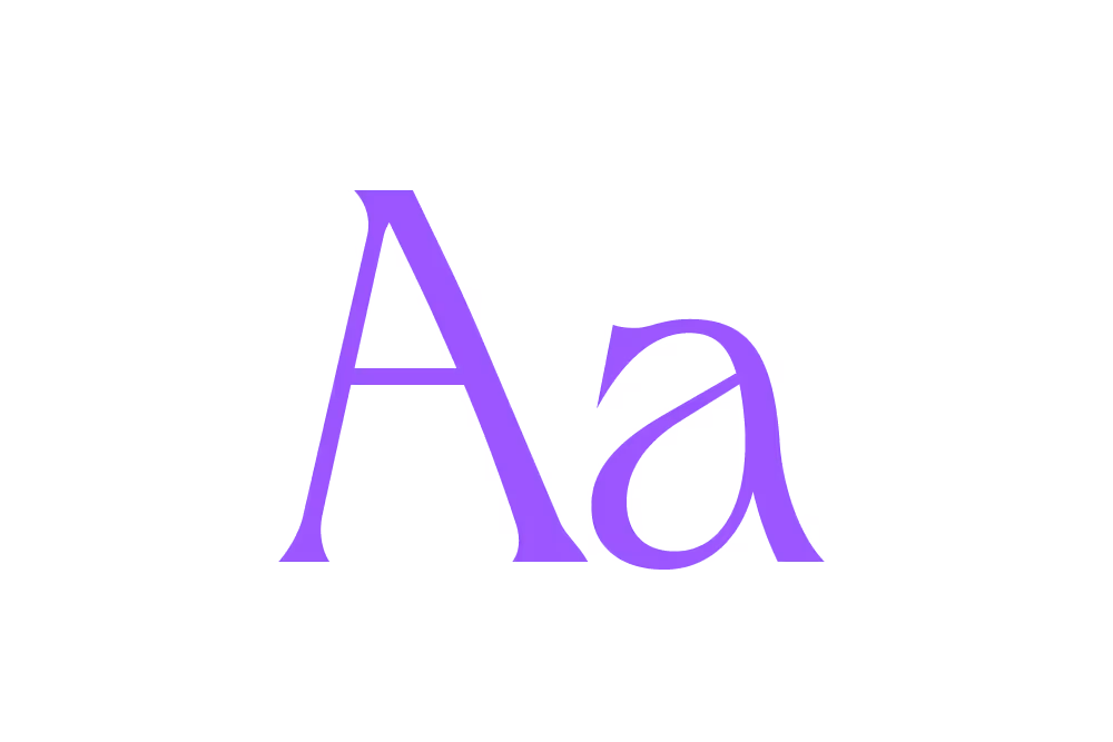
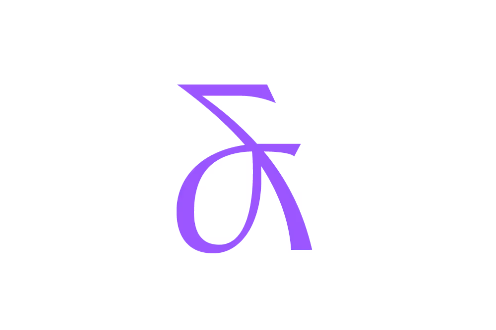
Sweet Ampersand
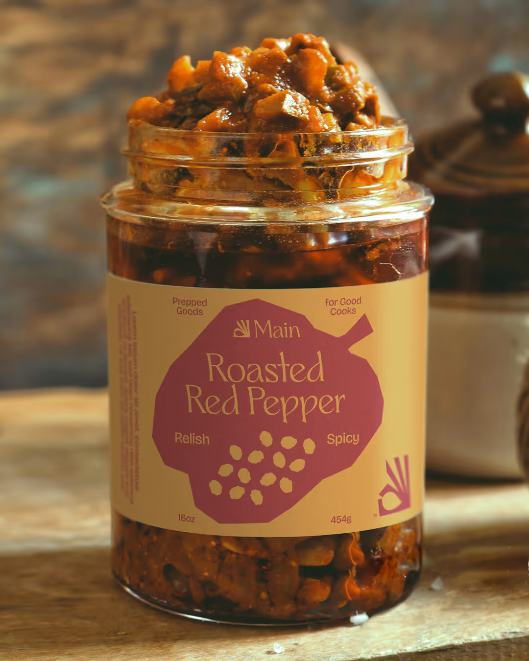
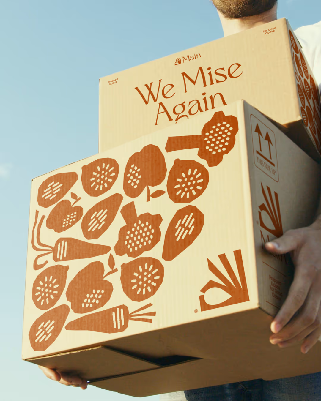
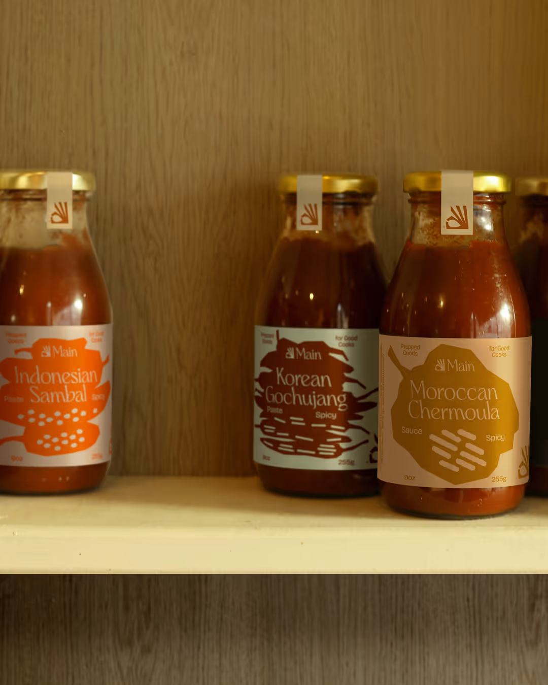
Lean On Me
Slotted Spoon brings warmth to large-scale text and headlines. Full transparency; it's not currently suited for body copy, but maybe I have something in the oven [ok, I do – text weight will be in a future release – I wouldn't leave you hanging like that].

Current Glyphs
Status
Buy-in early and get grandfathered into future tier updates, including font family expansions—free of charge (whoa).
Amateur - $25
uppercase
lowercase
basic latin
Punctuation + Math Operators
Novice - $$
latin 1 + supplement
diacritics
Latin Extended-A + B
Currency
Arrows
Fractions
alternates
Pro - $$$
text weight
light weight
bold weight
variable weight
Buy-in early and get grandfathered into future tier updates, including font family expansions—free of charge (whoa).
Check These Out